The team consisted of a Product Manager, a Developer, another Product Designer and myself.
Working as two designers, to collaborate efficiently, we established ownership for each feature while agreeing on a general structure and style to avoid confusion.
The team consisted of a Product Manager, a Developer, another Product Designer and myself.
Working as two designers, to collaborate efficiently, we established ownership for each feature while agreeing on a general structure and style to avoid confusion.
Team & My Role
Team & My Role
For each feature, we started with a competitive analysis to identify effective design patterns that could be imitated. We recognized that other banks had already gone so far ahead and implemented a lot of modern solutions.
For each feature, we started with a competitive analysis to identify effective design patterns that could be imitated. We recognized that other banks had already gone so far ahead and implemented a lot of modern solutions.
Inspiration
Inspiration
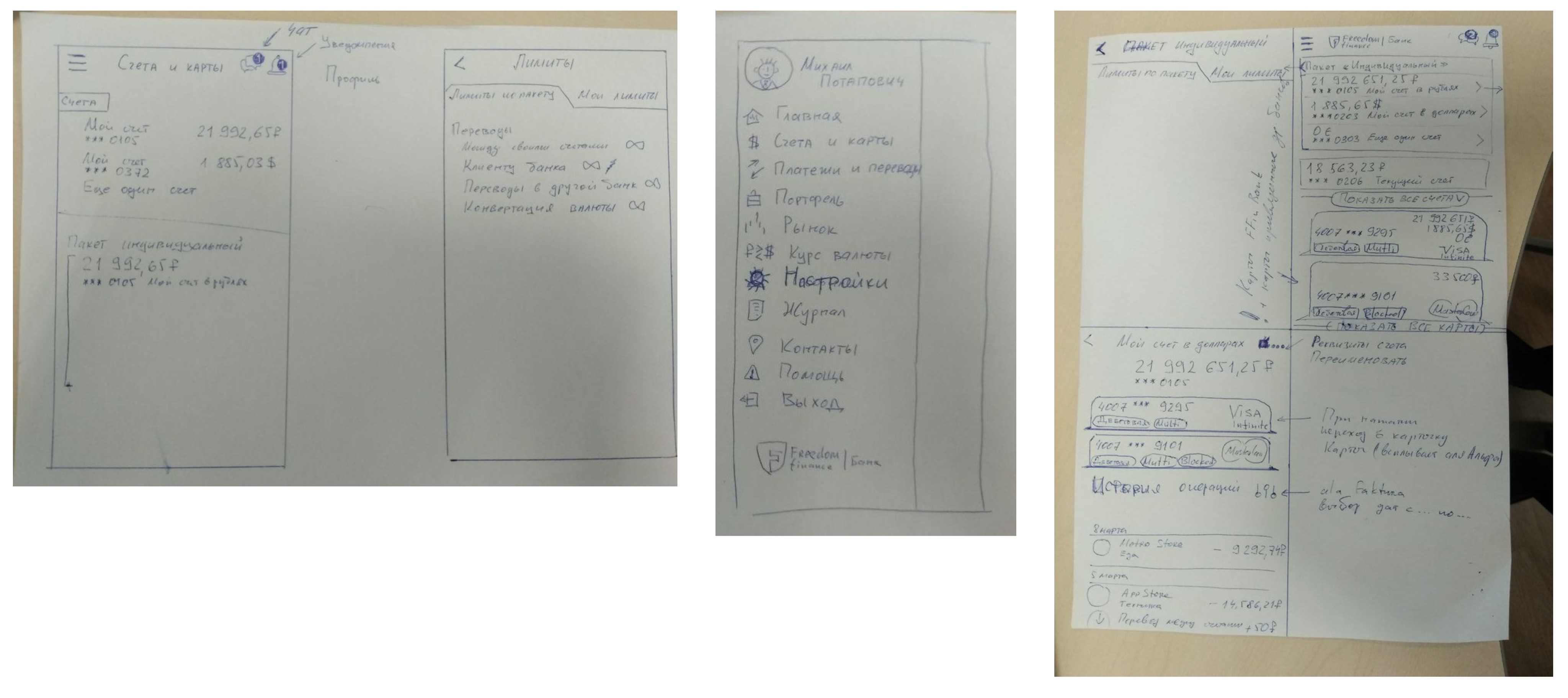
We then sketched each feature to quickly align within the team
on information architecture and gathered feedback from a small focus group in order to validate the selected idea.
We then sketched each feature to quickly align within the team
on information architecture and gathered feedback from a small focus group in order to validate the selected idea.
Sketching ideas
Sketching ideas
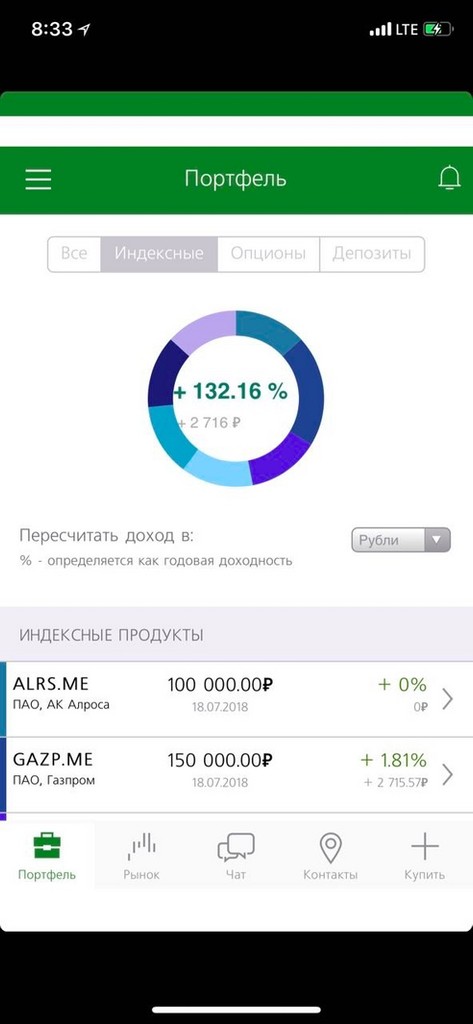
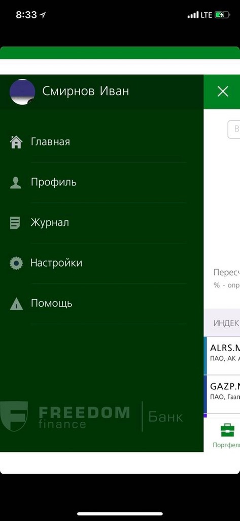
Using the information gathered to this point, we discovered a few problems in the existing app with the general structure and home screen:
1. Confusing navigation: It had both left-menu and tab bar, which users found confusing.
2. No list of accounts: There wasn't a clear page with all of the user's cards and accounts in one screen to see the actual amount of money they had.
Past Implementation (Navigation)
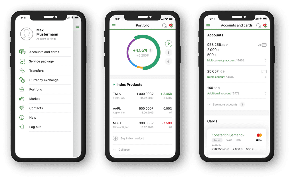
To address our user's feedback we:
1. Added a clear left menu which was similar to competitor apps that were widely used at the time.
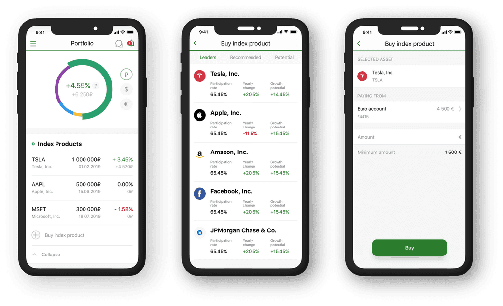
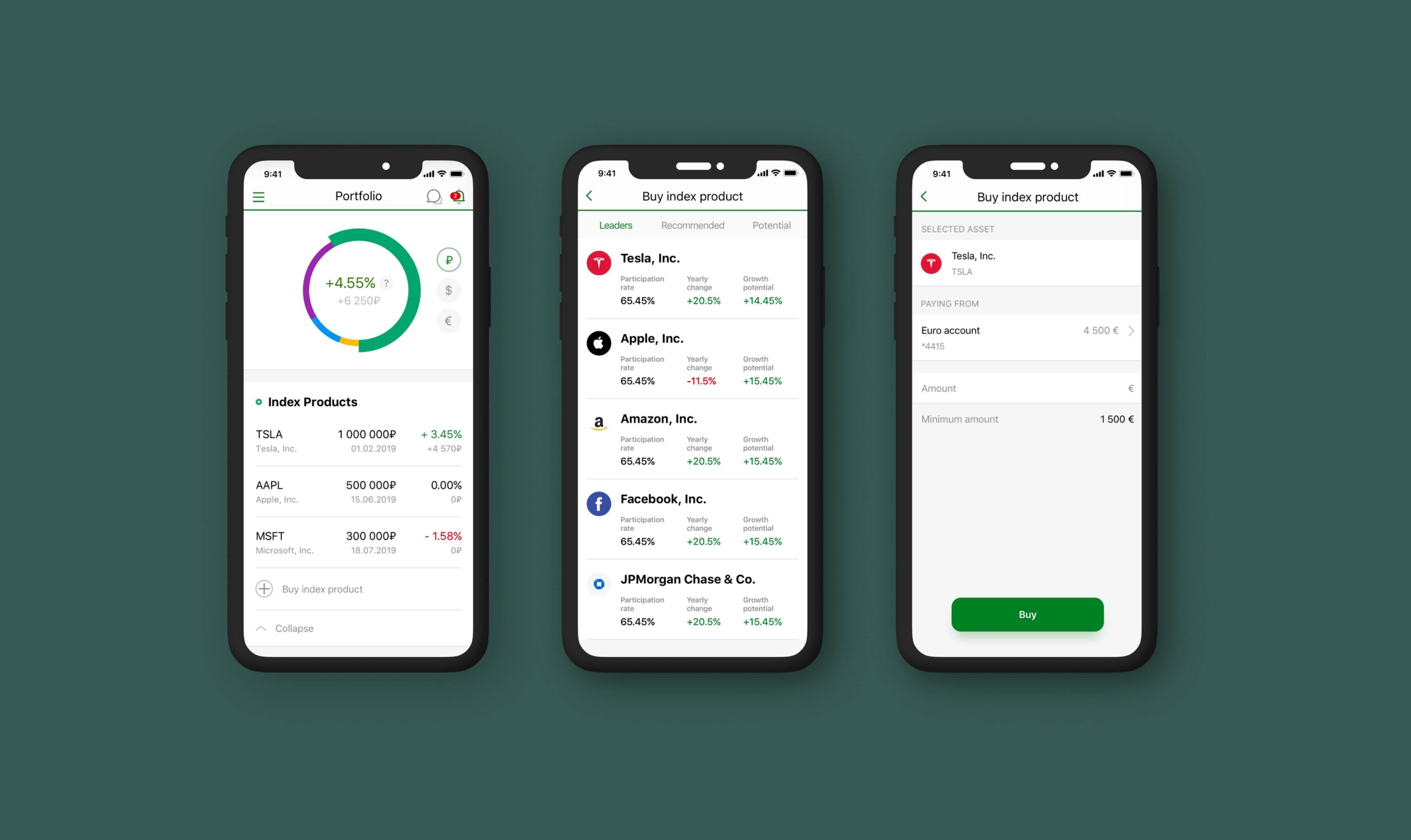
2. Added "Accounts and cards" screen to enable users to manage their bank products all in one place.
3. Improved portfolio dashboard: now users can buy a new product right from the list on this screen. This aimed to increase conversion because previously they had to go to a separate screen to do that.
Overall, we made the app look more modern and attractive.
Our Redesign
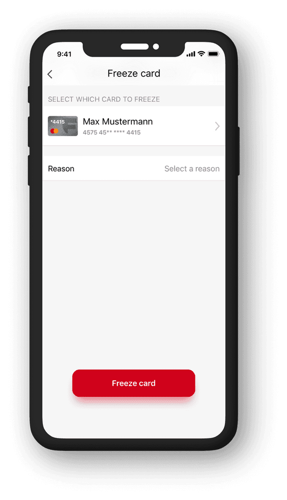
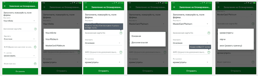
We allowed the user to select an existing card and freeze it on the spot.
The only three actions required from the user are:
1. Select a card
2. Provide a reason for freezing
3. Confirm
Our Redesign
After publishing our new version, we conducted A/B testing of the new version against the old one, and it gained better results in engagement and retention.
After publishing our new version, we conducted A/B testing of the new version against the old one, and it gained better results in engagement and retention.
Outcome
Outcome
I learned how to efficiently collaborate in a team of two designers without hierarchy.
I learned how to efficiently collaborate in a team of two designers without hierarchy.
Personal Takeaways
Personal Takeaways
Empathy mapping identified frustrations in the flow for freezing of the bank card in the mobile app.
To complete the step, the user had to enter information in a form which the bank already knew, for example: type of card, name of cardholder, card number.
We also found that users usually want to freeze their card when they lose it, which requires quick action.
Past Implementation
(Freezing Cards)
We allowed the user to select an existing card and freeze it on the spot.
The only three actions required from the user are:
1. Select a card
2. Provide a reason for freezing
3. Confirm
Our Redesign
Empathy mapping identified frustrations in the flow for freezing of the bank card in the mobile app.
To complete the step, the user had to enter information in a form which the bank already knew, for example: type of card, name of cardholder, card number.
We also found that users usually want to freeze their card when they lose it, which requires quick action.
Past Implementation (Freezing Cards)
Other redesign examples
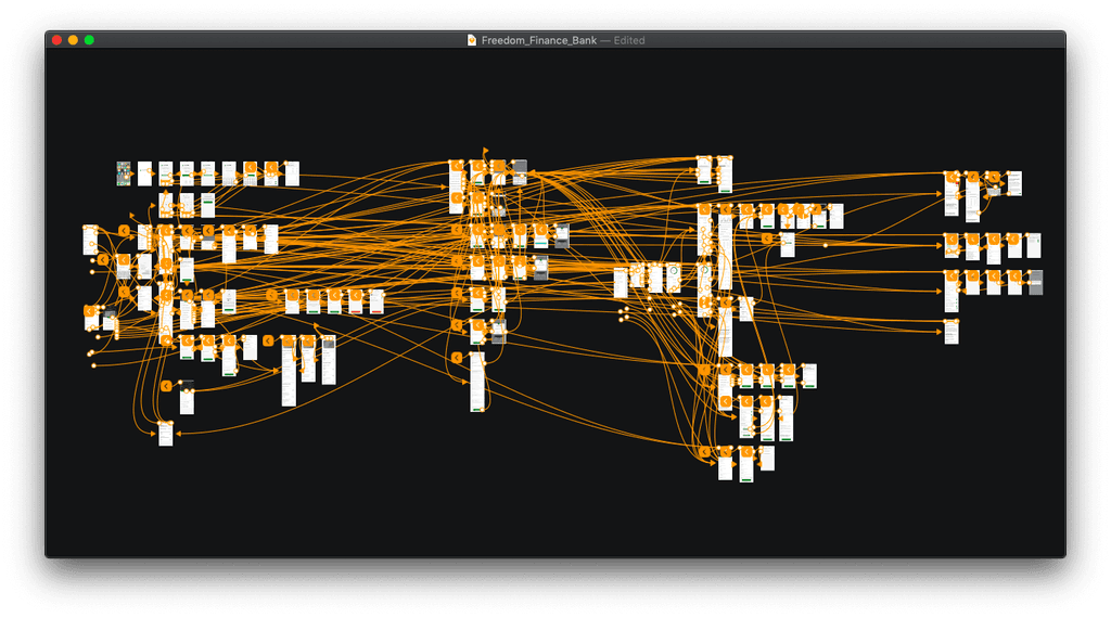
Over 100 screens were redesigned
To address our user's feedback we:
1. Added a clear left menu which was similar to competitor apps that were widely used at the time.
2. Added "Accounts and cards" screen to enable users to manage their bank products all in one place.
3. Improved portfolio dashboard: now users can buy a new product right from the list on this screen. This aimed to increase conversion because previously they had to go to a separate screen to do that.
Overall, we made the app look more modern and attractive.
Our Redesign
Using the information gathered to this point, we discovered a few problems in the existing app with the general structure and home screen:
1. Confusing navigation: It had both left-menu and tab bar, which users found confusing.
2. No list of accounts: There wasn't a clear page with all of the user's cards and accounts in one screen to see the actual amount of money they had.
Past Implementation
(Navigation)
Other redesign examples
Over 100 screens were redesigned
Freedom Finance Bank
Mobile banking app enabling investors to easily view and manage their portfolio
Freedom Finance Bank
Mobile banking app enabling investors to easily view and manage their portfolio
Product Designer
My Role
Product Designer
My Role
Banking Product Redesign
My Responsibilities
Banking Product Redesign
My Responsibilities
70,000
Client base
70,000
Client base
Freedom Finance Bank is a European private bank focusing on the American stock market, as well as the markets of Russia and Germany.
The bank identified that their mobile app wasn't intuitive because it hadn't been updated for 6 years. They engaged this freelance team to conduct research on possible ways to increase engagement and retention, and use findings to redesign the app.
I was Freedom Finance Bank is a European e bank focusing on the American stock market, as well as the markets of Russia and Germany.
The bank identified that their mobile app wasn't intuitive because it hadn't been updated for 6 years. They engaged this freelance team to conduct research on possible ways to increase engagement and retention, and use findings to redesign the app
Background
Background